Design
Start designing your storefront that will fit with your business branding.
Store
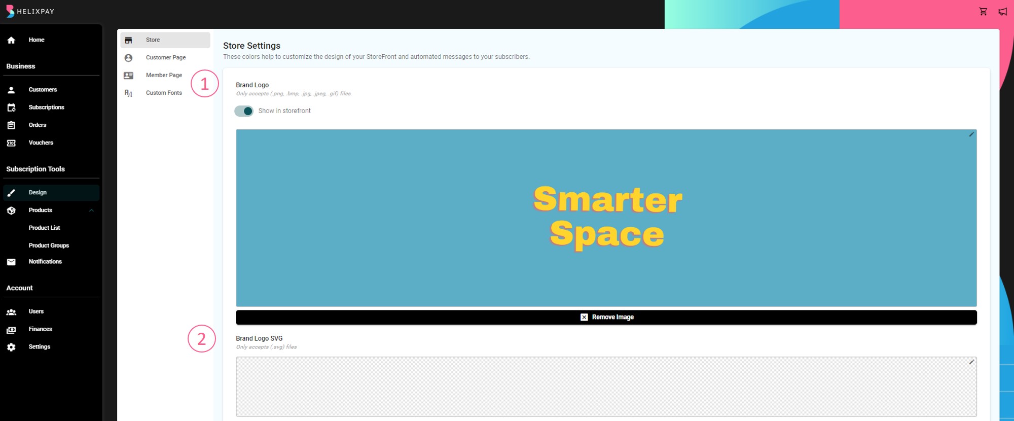
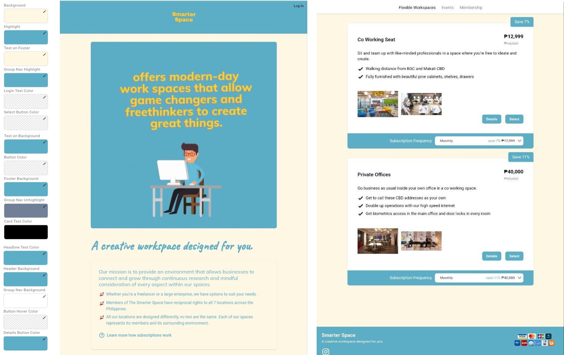
This section lets you customize the design of their storefront by uploading their logo and banner, as well as setting up the store colors to fit their branding. These configurations are going to be applied to both the storefront and the automated messages.
To customize the design of their store, the merchant's can edit the following:
- Brand Logo
- Brand Logo SVG
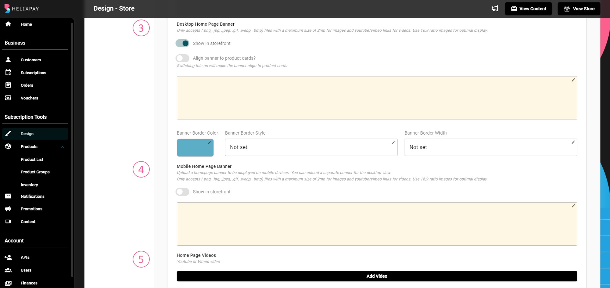
- Desktop Home Page Banner
- Mobile Home Page Banner
- Home Page Videos
- Sold out Banner
- Favicon

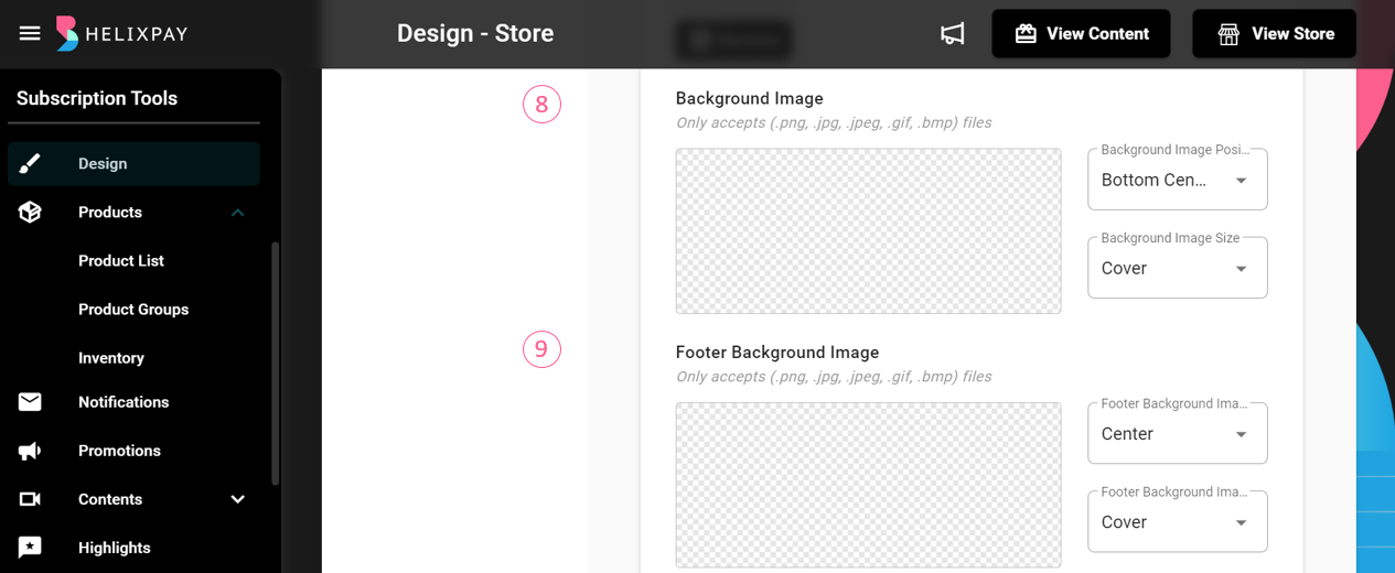
- Background Image
- Footer Background Image
- Store Colors
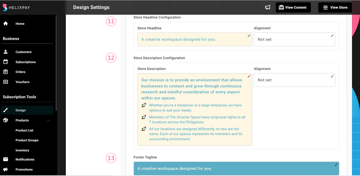
- Store Headline
- Store Description
- Footer Tagline
- PDF Button Label
- Payment CTA Button Label
- Recurring Payment Button Label
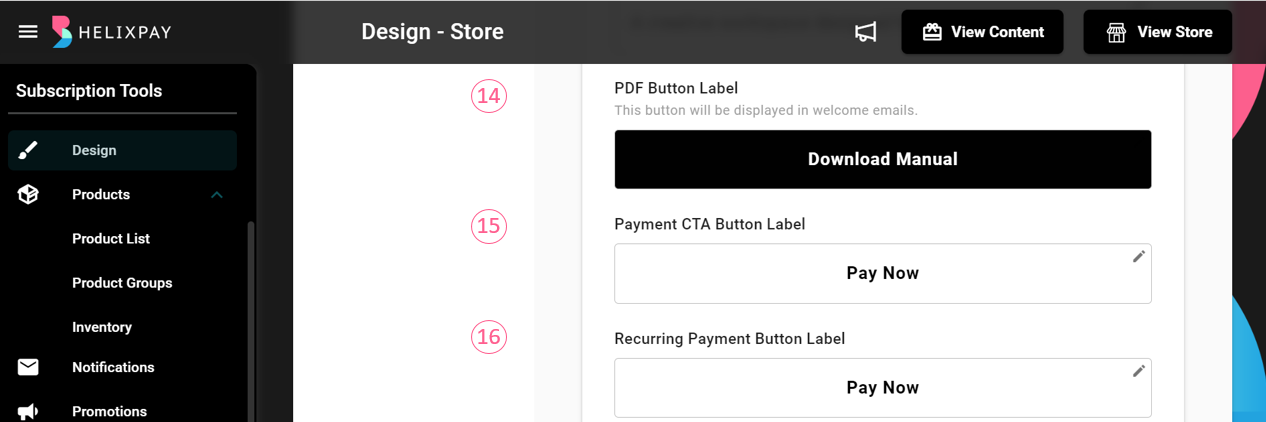
- Button Texts (Product Details, Product Card Button Drop Shadow, Product Select, Product Stock Count, Checkout, Add to Order, Content Page, Featured Products Title)
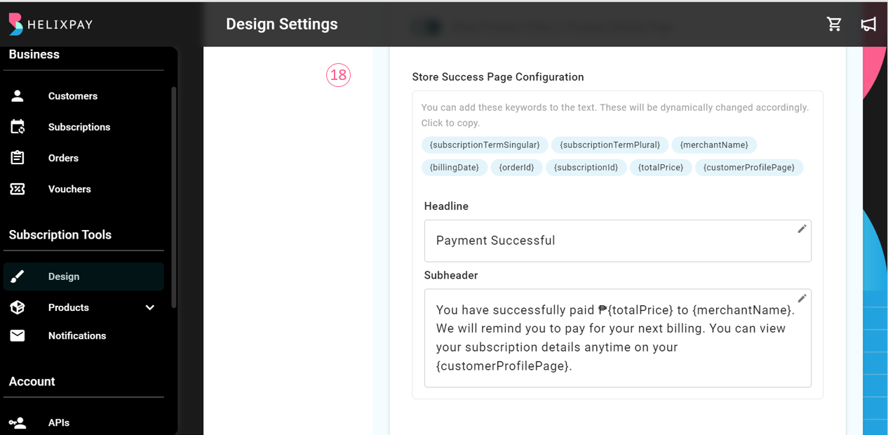
- Storefront Success Page
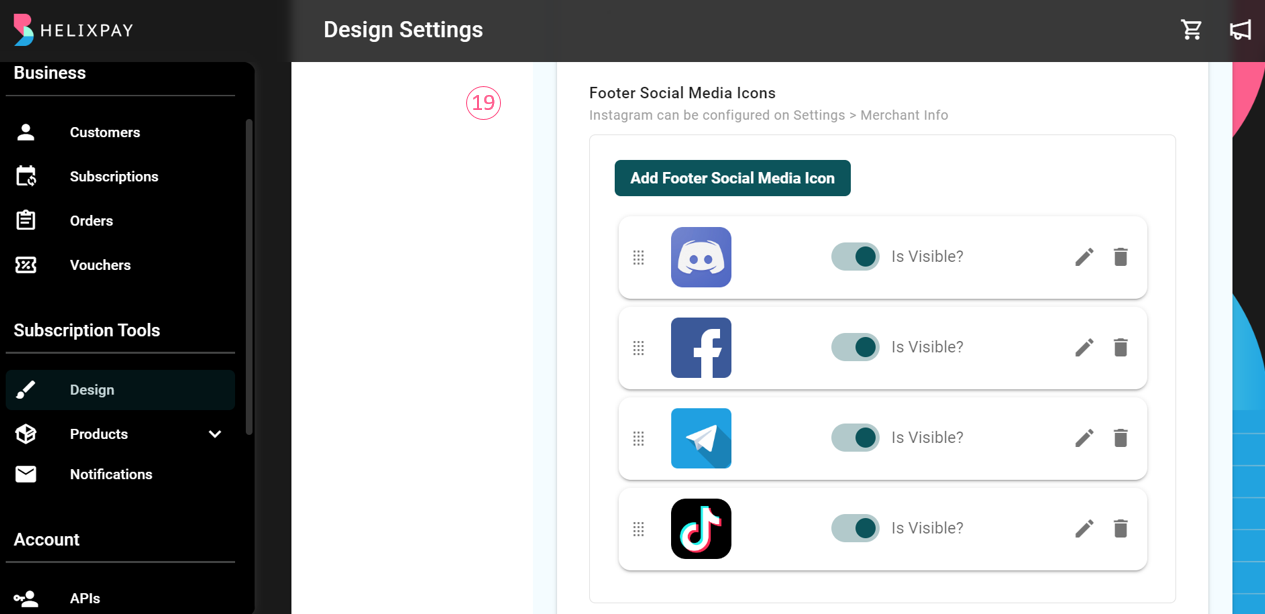
- Footer Social Media Icons
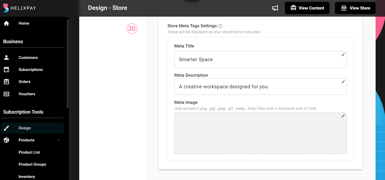
- Store Meta Tags Settings
Customer Page
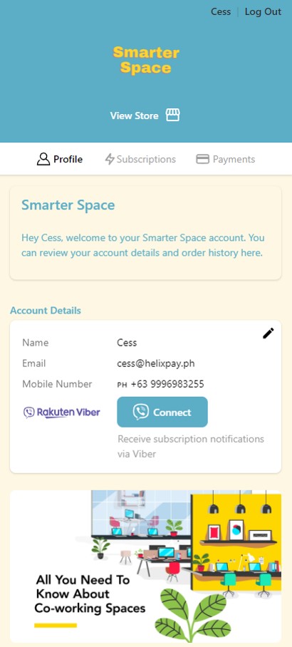
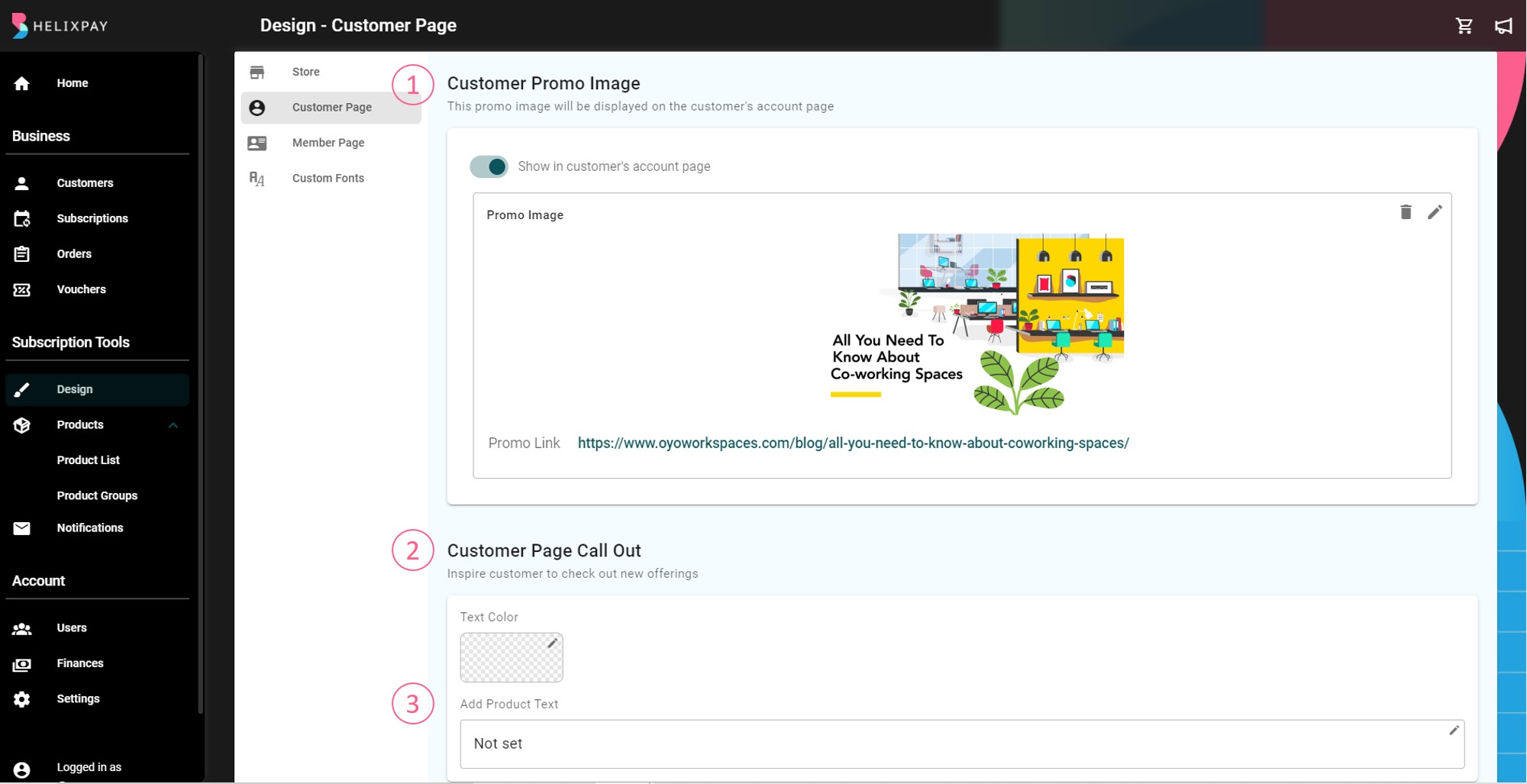
The Customer Page is where the customers can see their active subscription(s) and payment history. HelixPay automatically creates an account for new customers and they can use this to log-in to the customer page through the merchant storefront. Adding a Promo Image in the customer page will let the customers see it every time they log-in. The merchants may also add any link to the promo image, so when the customers clicked the image, they will be redirected to where they can see more information about the promo. This feature can be used not only for promos but also for any type of announcements or news the merchants want to share with their customers.
Below is an example of what the Promo Image looks like in the Customer Page:
Start sharing updates to the Customer Page setting up the following:
- Promo Image
- Text Color
- Product Text
Content Page
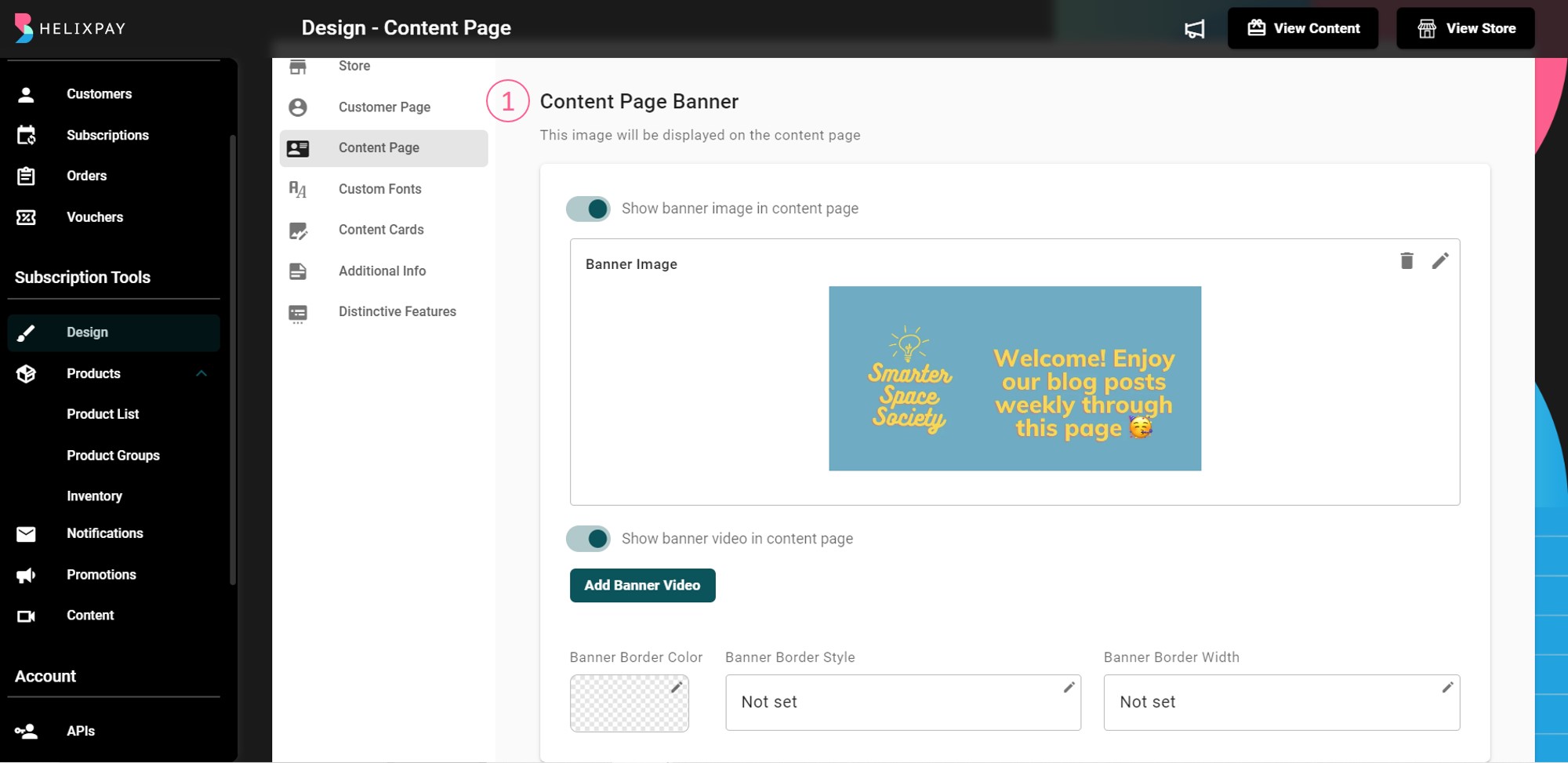
The content page displays the email blast and video content that are limited for members only. Customers who purchased and paid for a membership subscription will be the only ones who can access the contents published on this page.
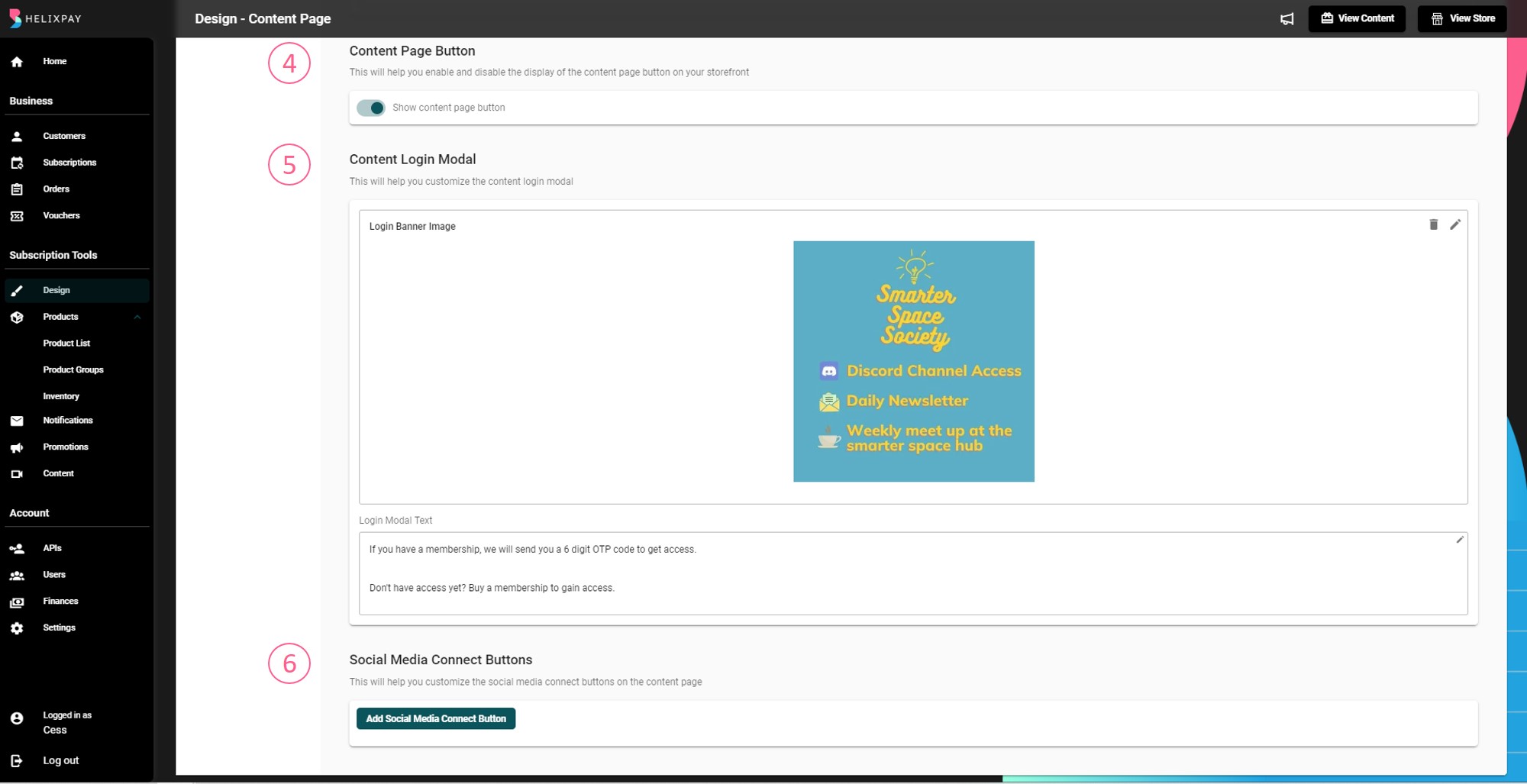
The following are the customizations you can do on the content page:
- Content Page Banner
- Content Page Text Color
- Content Page Description
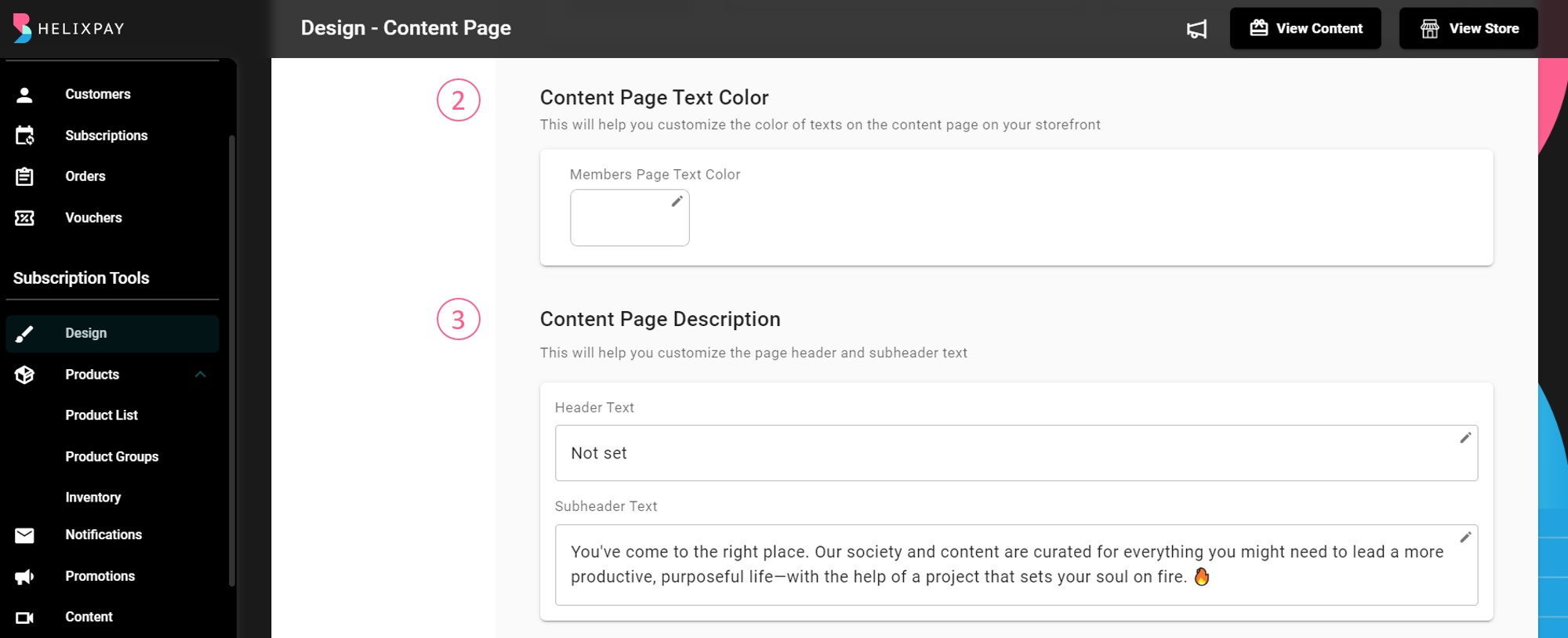
- Content Page Button
- Content Page Login Modal
- Social Media Connect Buttons
Custom Fonts
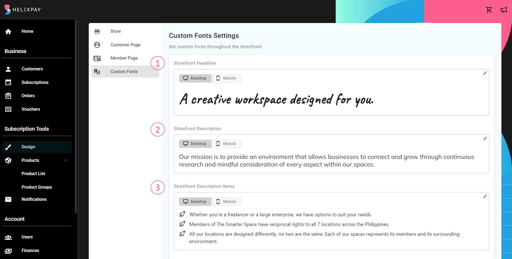
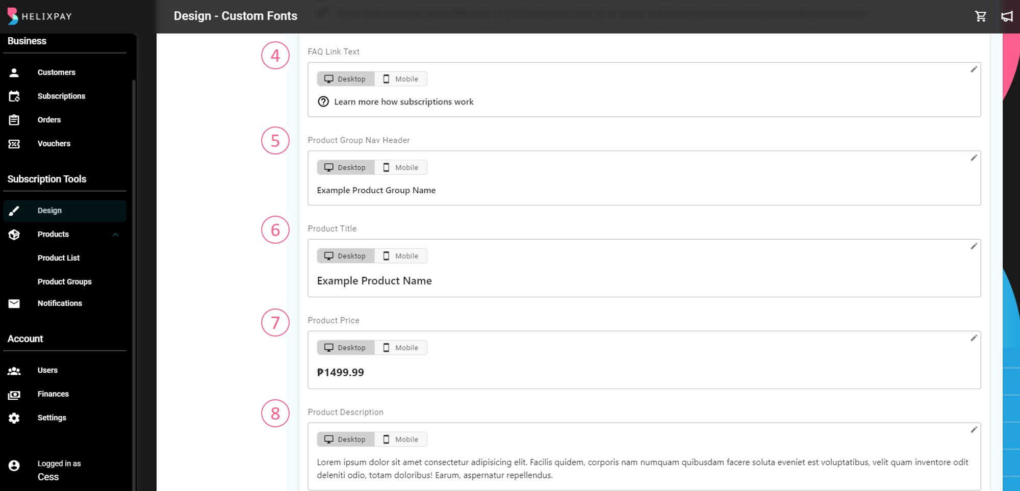
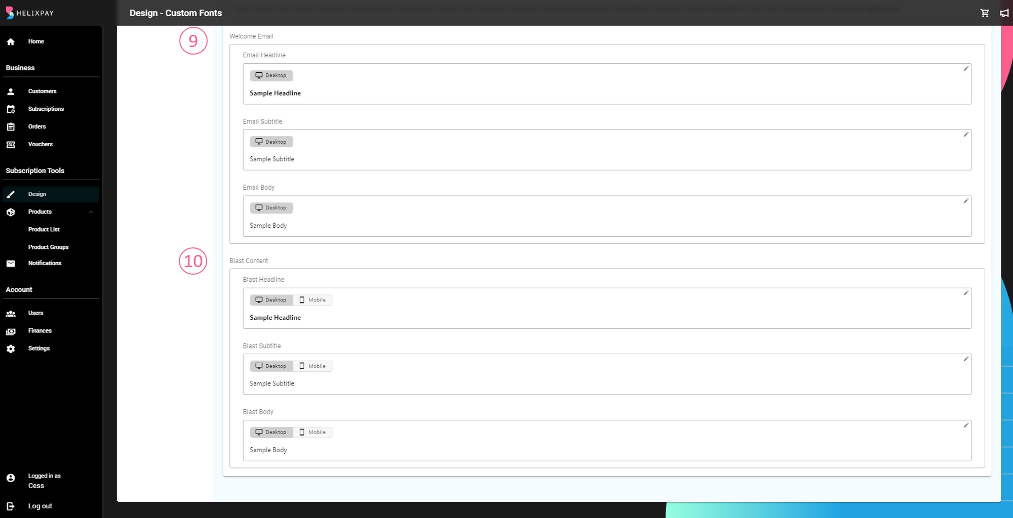
This section lets the merchants customize the storefront’s font style and font size to fit the branding better. Merchants can change the text on the following parts of the storefront:
- Storefront Headline
- Storefront Description
- Storefront Description Items
- FAQ Link Text
- Product Group Nav Header
- Product Title
- Product Price
- Product Description
- Welcome Email
- Blast Content
Content Cards
Boost your customer engagement by highlighting contents right on the storefront. Follow these steps to create your content card:
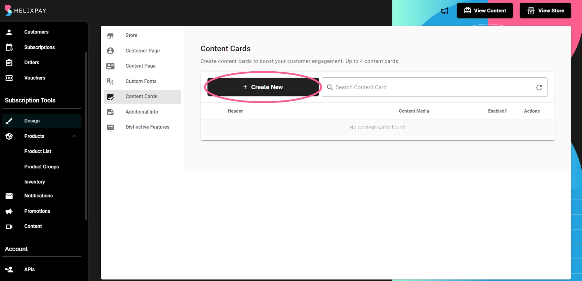
Step 1: Go to Design Page > Content Cards then click '+ Create New'.
Step 2: Configure the Header.
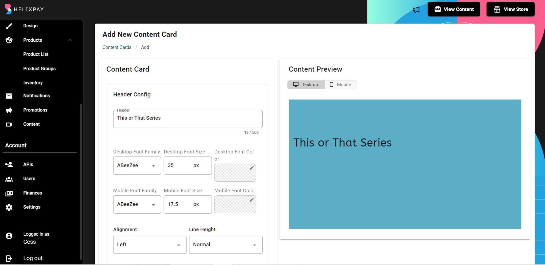
You can customize both Desktop and Mobile view and you will see the preview on the side as you configure each components of the content card.
Step 3: Configure Sub-header.
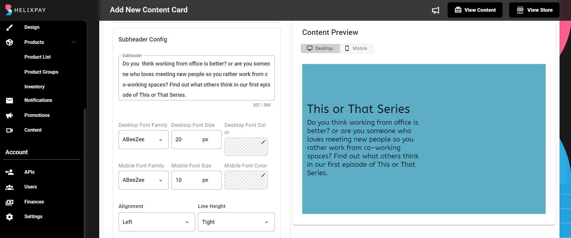
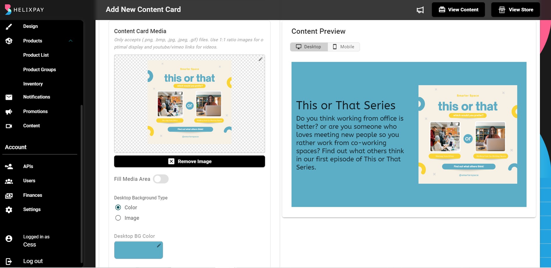
Step 4: Add content card media and set the colors.
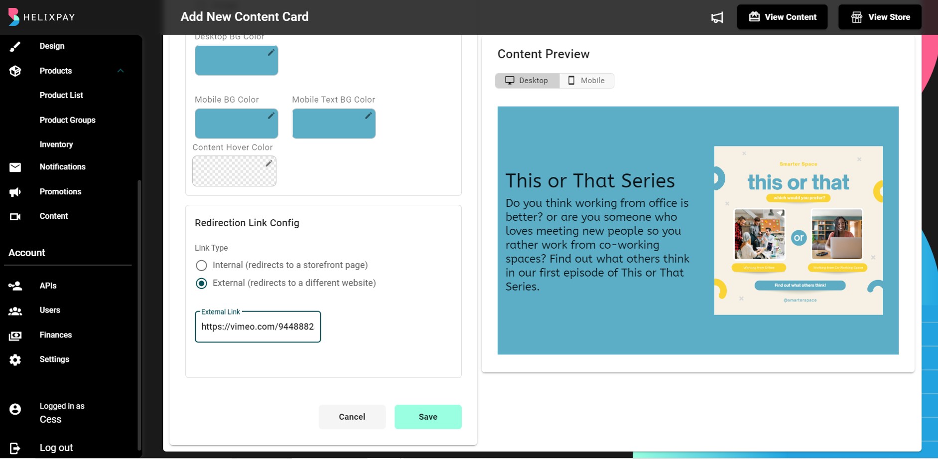
Step 5: Configure the Redirection Link. You can choose to link your content card to an external source or to a specific product, content, or product group within your storefront when you chose internal link.
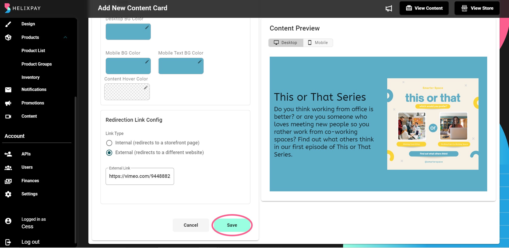
Step 6: Click 'Save'!
Distinctive Features
Highlight what differentiates your brand and product from others in the industry with the Distinctive Features.
Steps in adding Distinctive Features:
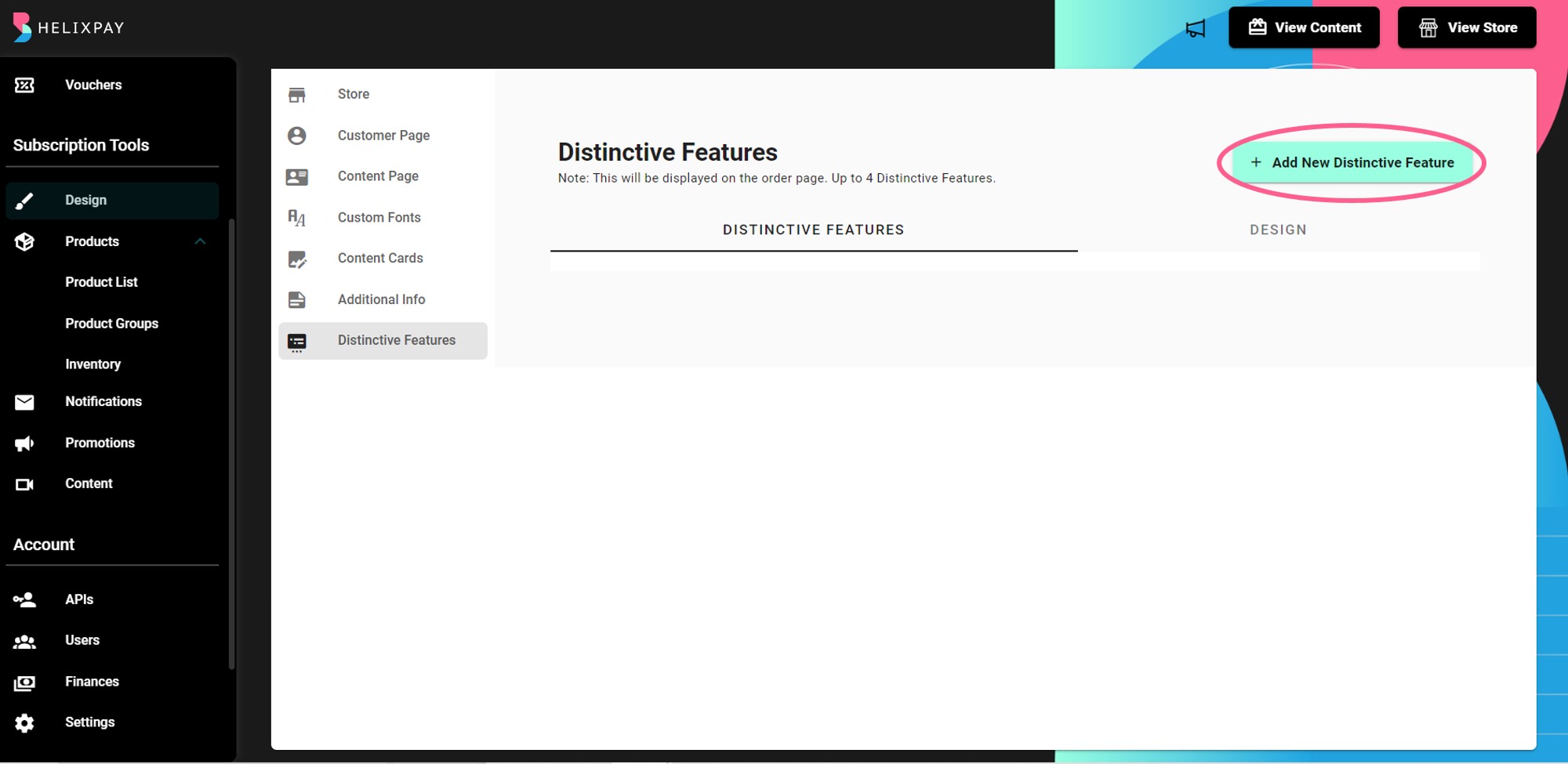
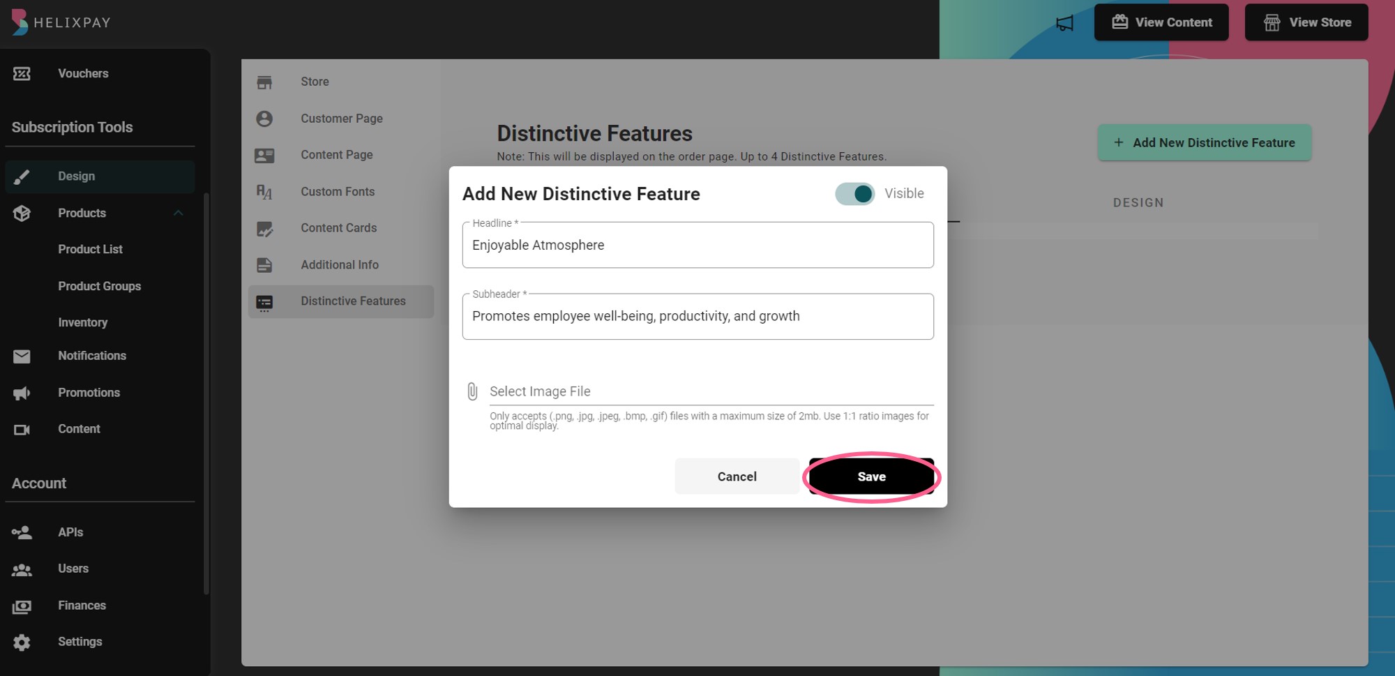
Step 1: Go to Design > Distinctive Features then click '+ Add New Distinctive Feature'.
Step 2: Add Headline, Sub-header, and Image.

Step 3: Save distinctive feature.
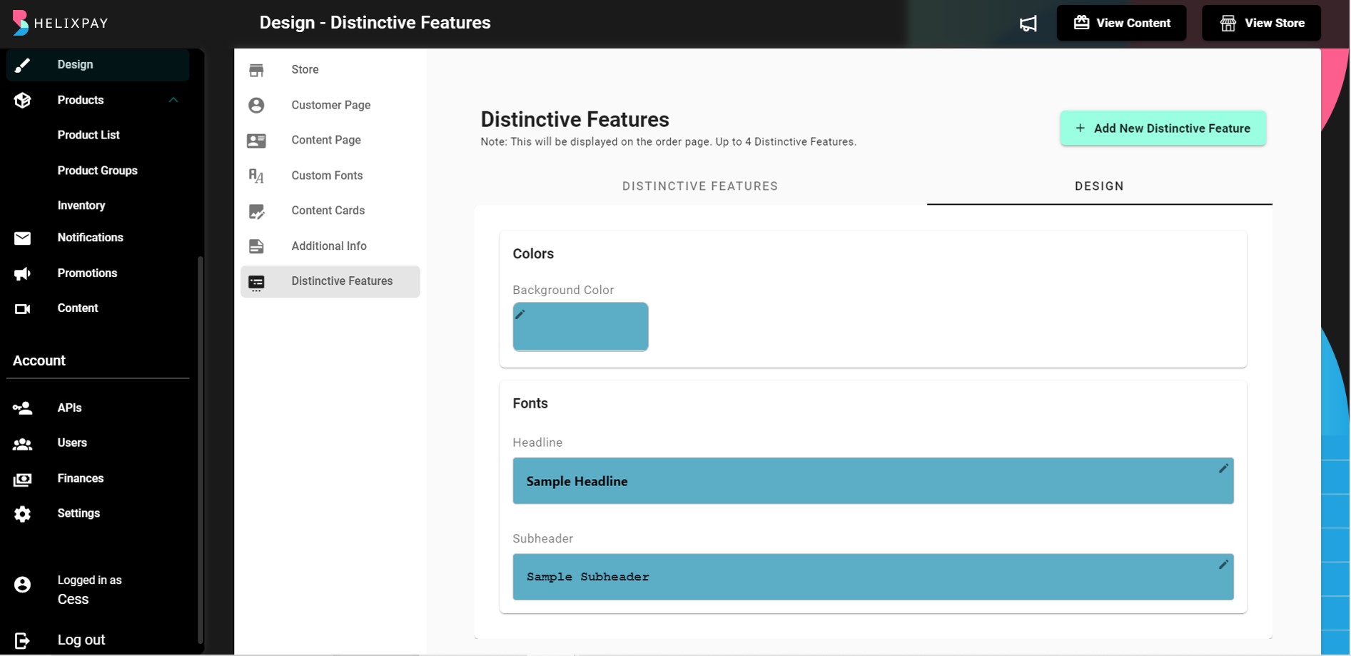
💡 You can also customize the background color and font style from the Design section.
Updated about 2 years ago
